My hero section has a two-column grid: intro text on one side, a small decorative code snippet on the other. On desktop, it looked fine. On a phone, the entire page grew a horizontal scrollbar, and the code panel spilled off the right edge of the screen — cut off mid-sentence, dragging the whole layout wider than the viewport with it.
The setup
The hero uses a straightforward grid:
.hero-grid {
  display: grid;
  grid-template-columns: 1.1fr 0.9fr;
  gap: 56px;
}
The right column holds a <pre> block with a line of JavaScript that doesn't wrap — const builder = new Developer("Shayan Hassan DeV"); — styled with overflow-x: auto so long lines scroll horizontally within their own box instead of breaking the layout. That's the standard fix for exactly this situation. It didn't work.
Why overflow-x: auto wasn't enough
The bug isn't in the element with the long content — it's in its ancestor. Grid and flex items have a default minimum size of min-width: auto, which effectively means "don't shrink smaller than my content's natural width." A <pre> tag's natural width is the width of its longest unbroken line. So even though the <pre> itself was set to scroll its overflow, the grid column containing it refused to shrink below that line's full width — and dragged the whole grid, and the whole page, wider along with it.
overflow-x: auto controls what happens to content that overflows its own box. It does nothing to stop that box's ancestor from growing to accommodate it in the first place. Two different problems that look like the same problem until you isolate them.
The actual fix
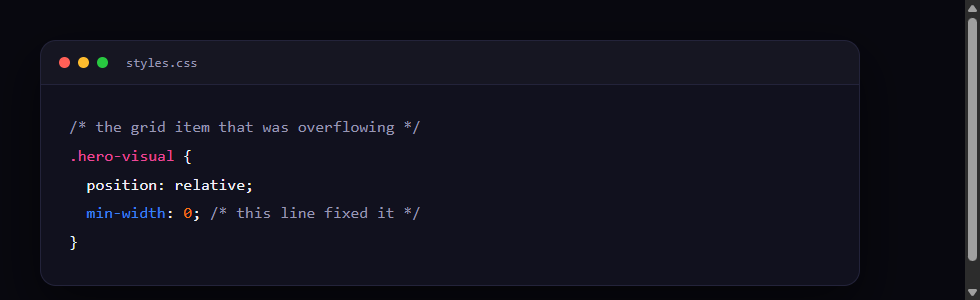
One line, on the grid item itself, not the scrolling element inside it:
.hero-visual {
  min-width: 0;
}
That explicitly overrides the default auto, telling the grid column it's allowed to shrink below its content's intrinsic width. Once it can shrink, the <pre>'s own overflow-x: auto finally gets to do its job — the code scrolls horizontally inside its little box, and the rest of the page stays exactly as wide as the screen.
Why this one is easy to miss
It only shows up when three things line up at once: a grid or flex container, a child with content that can't wrap (code, a long URL, a table), and a viewport narrow enough that the content's natural width exceeds it. On a wide desktop monitor, the grid column has plenty of room and the bug never triggers — it looks like completely ordinary, working CSS until someone opens the page on a phone. If your layout mysteriously grows a horizontal scrollbar only on narrow screens, and the offending content is inside a grid or flex item, checking for a missing min-width: 0 is worth doing before anything more exotic.